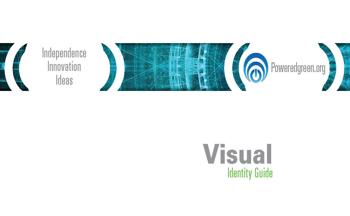
Powered Green
Branding Development
Branding Development
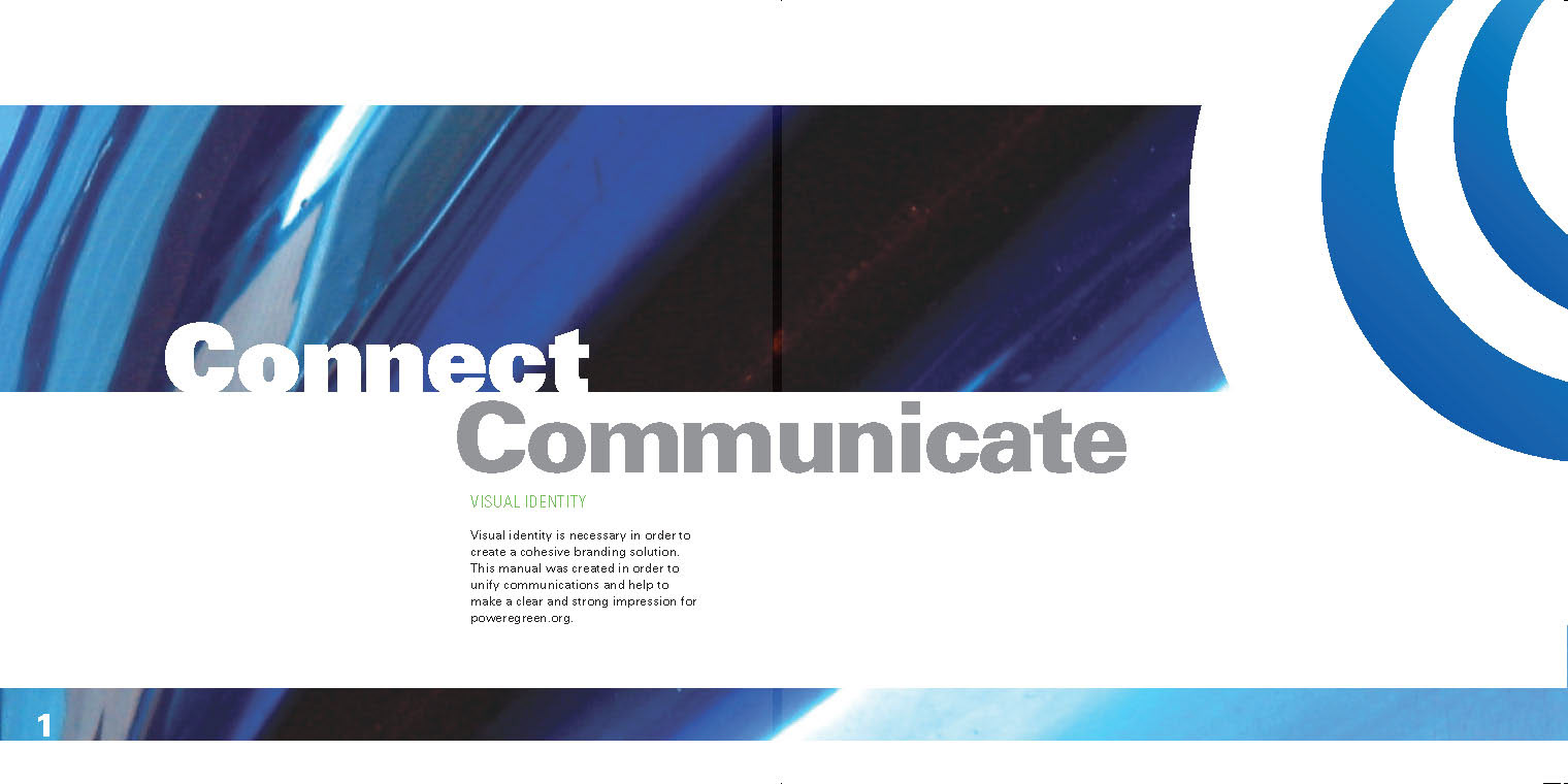
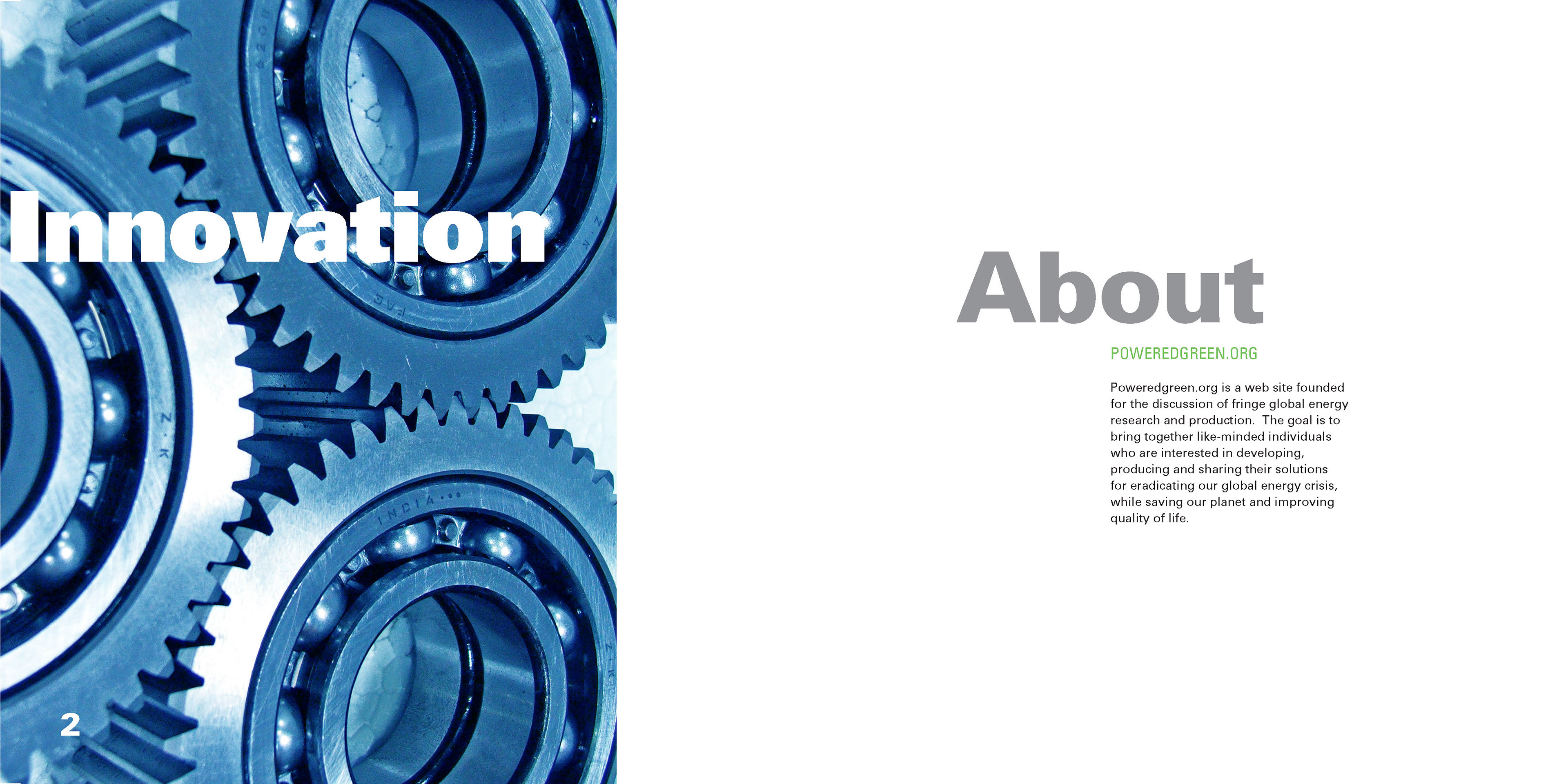
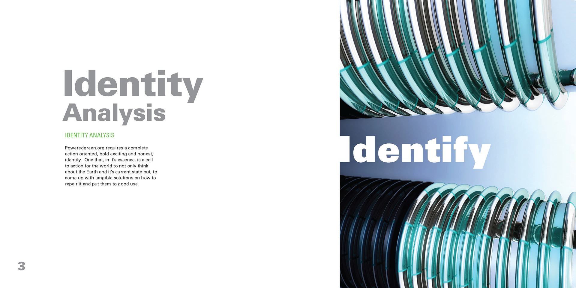
Poweredgreen.orgis a website founded for the discussion of fringe global energy research andproduction. The goal is to bringtogether likeminded individuals who are interested in developing, producing andsharing their solutions for eradicating our global energy crisis in order to save the planet and improve quality of life for everyone Poweredgreen.orgneeds a complete action oriented and honest corporate identity. An identity which is a call toaction to think about the Earth it’s current stateand tangible solutions to energy independence.
Thereis a ocean of competition out there for poweredgreen.org to stand out from. Every green organization has a centralfocus, improving quality of life on planet Earth. The difference is, how they plan on going about portrayingand working their plans for success.
Thepoweredgreen.org website is meant for engineers and divergent thinkers with bright ideas for fresh and efficient energy sources.Engineers apply the principles of science and mathematics to develop economicalsolutions to technical problems. Their work is the link between scientificdiscoveries and the commercial applications which meet societal and consumerneeds.
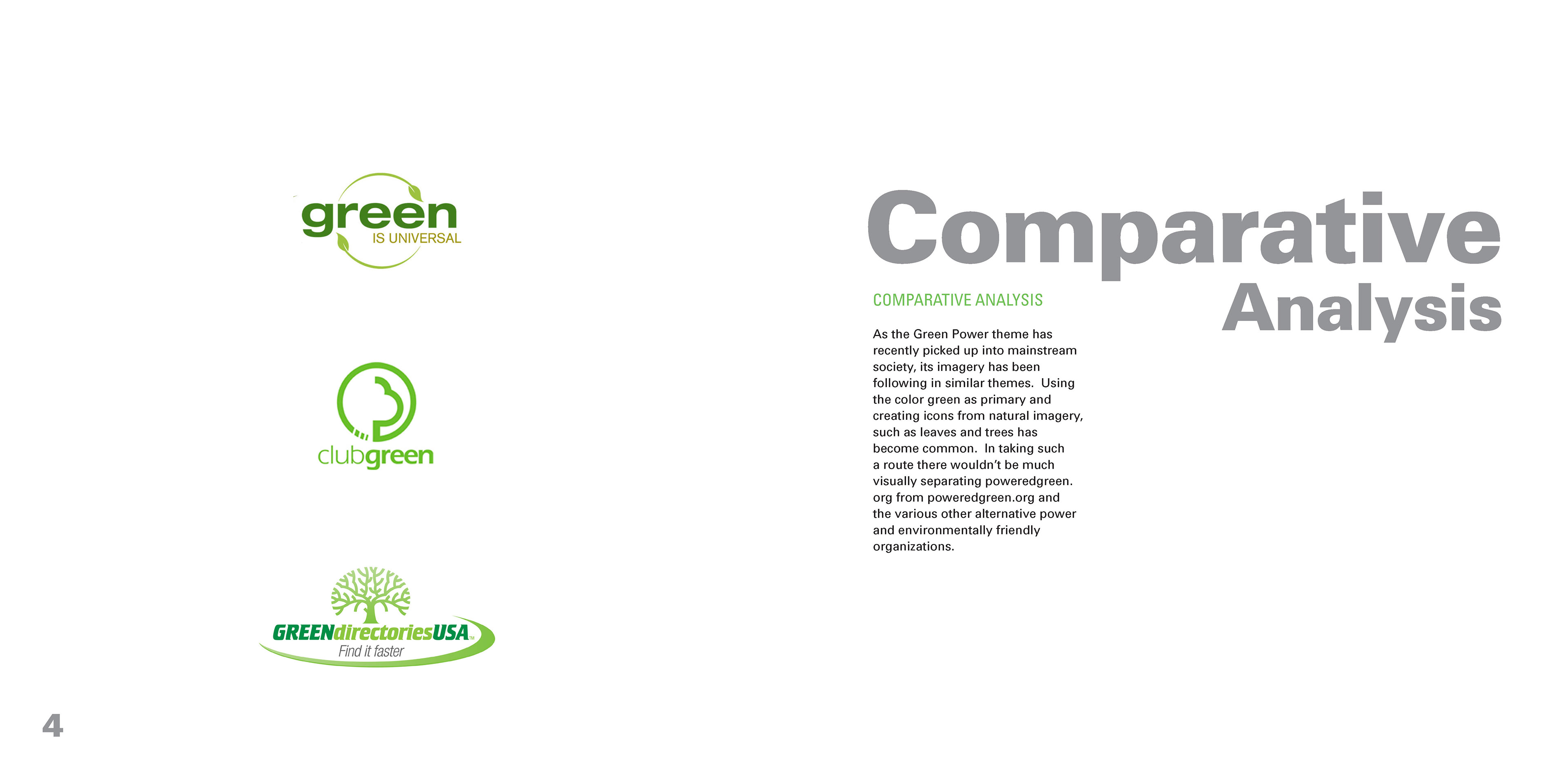
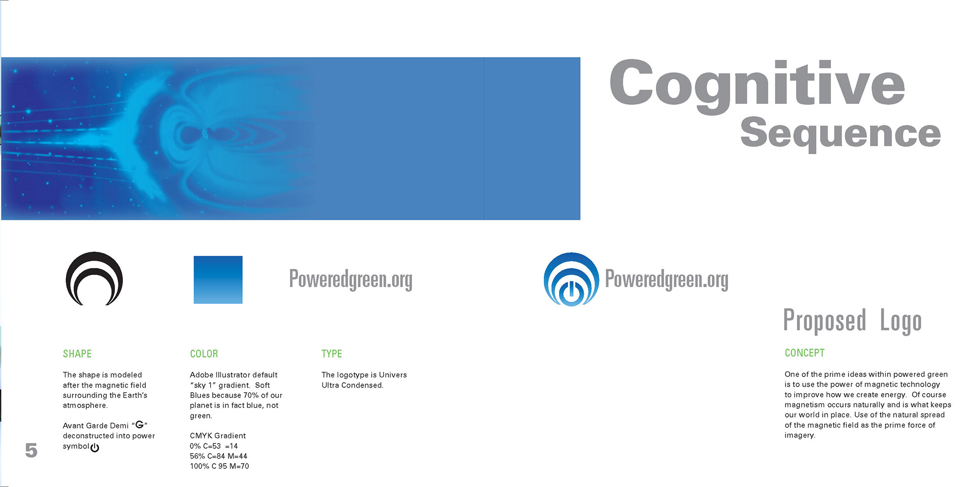
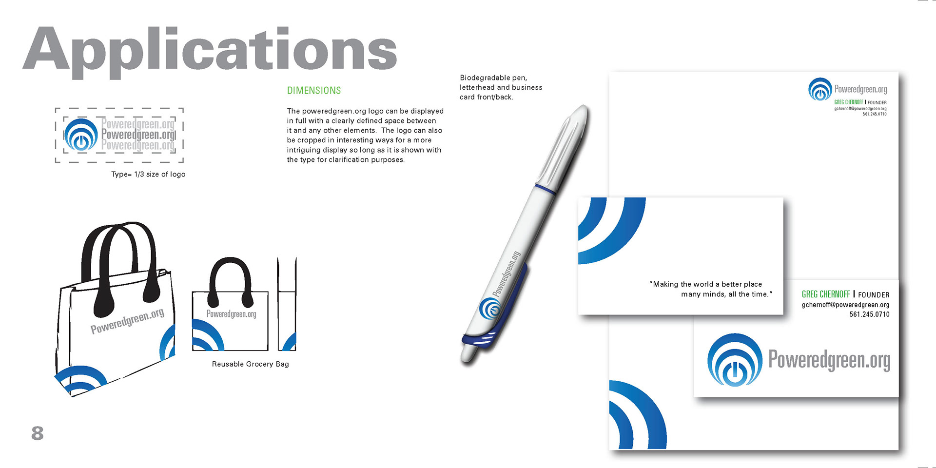
As the GreenPower theme has picked up into mainstream society, its imagery hasbeen following in similar themes. Using the color green as primary and creating icons from naturalimagery, such as leaves and trees has become commonplace and trite. In taking such a route there wouldn’t bemuch visually separating poweredgreen.org from poweredgreen.com and the variousother alternative power and environmentally friendly organizations. As a forward thinking designer I opt to take adifferent strategy in development of a poweredgreen.org logo; Combining the concepts of magnetic field and the most familiar color on our planet: blue.
Thereis a ocean of competition out there for poweredgreen.org to stand out from. Every green organization has a centralfocus, improving quality of life on planet Earth. The difference is, how they plan on going about portrayingand working their plans for success.
Thepoweredgreen.org website is meant for engineers and divergent thinkers with bright ideas for fresh and efficient energy sources.Engineers apply the principles of science and mathematics to develop economicalsolutions to technical problems. Their work is the link between scientificdiscoveries and the commercial applications which meet societal and consumerneeds.
As the GreenPower theme has picked up into mainstream society, its imagery hasbeen following in similar themes. Using the color green as primary and creating icons from naturalimagery, such as leaves and trees has become commonplace and trite. In taking such a route there wouldn’t bemuch visually separating poweredgreen.org from poweredgreen.com and the variousother alternative power and environmentally friendly organizations. As a forward thinking designer I opt to take adifferent strategy in development of a poweredgreen.org logo; Combining the concepts of magnetic field and the most familiar color on our planet: blue.